Customization
Most of the cart templates are overridable. You can also override the CSS for aesthetic changes.
Getting started
When installing Snipcart, you have to create an object with configuration settings.
<script>
  window.SnipcartSettings = {
    publicApiKey: "YOUR_API_KEY",
    loadStrategy: "on-user-interaction",
  };

  (()=>{var a,d;(d=(a=window.SnipcartSettings).version)!=null||(a.version="3.0");var s,S;(S=(s=window.SnipcartSettings).currency)!=null||(s.currency="usd");var l,p;(p=(l=window.SnipcartSettings).timeoutDuration)!=null||(l.timeoutDuration=2750);var w,u;(u=(w=window.SnipcartSettings).domain)!=null||(w.domain="cdn.snipcart.com");var m,g;(g=(m=window.SnipcartSettings).protocol)!=null||(m.protocol="https");var y=window.SnipcartSettings.version.includes("v3.0.0-ci")||window.SnipcartSettings.version!="3.0"&&window.SnipcartSettings.version.localeCompare("3.4.0",void 0,{numeric:!0,sensitivity:"base"})===-1,f=["focus","mouseover","touchmove","scroll","keydown"];window.LoadSnipcart=o;document.readyState==="loading"?document.addEventListener("DOMContentLoaded",r):r();function r(){window.SnipcartSettings.loadStrategy?window.SnipcartSettings.loadStrategy==="on-user-interaction"&&(f.forEach(t=>document.addEventListener(t,o)),setTimeout(o,window.SnipcartSettings.timeoutDuration)):o()}var c=!1;function o(){if(c)return;c=!0;let t=document.getElementsByTagName("head")[0],e=document.querySelector("#snipcart"),i=document.querySelector(`src[src^="${window.SnipcartSettings.protocol}://${window.SnipcartSettings.domain}"][src$="snipcart.js"]`),n=document.querySelector(`link[href^="${window.SnipcartSettings.protocol}://${window.SnipcartSettings.domain}"][href$="snipcart.css"]`);e||(e=document.createElement("div"),e.id="snipcart",e.setAttribute("hidden","true"),document.body.appendChild(e)),h(e),i||(i=document.createElement("script"),i.src=`${window.SnipcartSettings.protocol}://${window.SnipcartSettings.domain}/themes/v${window.SnipcartSettings.version}/default/snipcart.js`,i.async=!0,t.appendChild(i)),n||(n=document.createElement("link"),n.rel="stylesheet",n.type="text/css",n.href=`${window.SnipcartSettings.protocol}://${window.SnipcartSettings.domain}/themes/v${window.SnipcartSettings.version}/default/snipcart.css`,t.prepend(n)),f.forEach(v=>document.removeEventListener(v,o))}function h(t){!y||(t.dataset.apiKey=window.SnipcartSettings.publicApiKey,window.SnipcartSettings.addProductBehavior&&(t.dataset.configAddProductBehavior=window.SnipcartSettings.addProductBehavior),window.SnipcartSettings.modalStyle&&(t.dataset.configModalStyle=window.SnipcartSettings.modalStyle),window.SnipcartSettings.currency&&(t.dataset.currency=window.SnipcartSettings.currency),window.SnipcartSettings.templatesUrl&&(t.dataset.templatesUrl=window.SnipcartSettings.templatesUrl))}})();
</script>
To add customized components, you need to refer to an HTML file that will hold the customized components in the templatesUrl attribute:
window.SnipcartSettings = {
    publicApiKey: "YOUR_API_KEY",
    templatesUrl: "/snipcart-templates.html",
};
In your snipcart-templates.html file, put all your overridden components in a div with id snipcart-templates.
Refer to this documentation entry to see the list of components. Every component that has a Default Template can be overridden.
<!DOCTYPE html>
<html>
    <head><title>Templates</title></head>

    <body>
        <div id="snipcart-templates">
            <!-- Insert template overrides here -->
        </div>
    </body>
</html>
To override a template, insert a node into the div#snipcart-templates div. The node tag must be the name of the component you want to override. For example, if you wanted to override the template named item-line, you would do this:
<div id="snipcart-templates">
    <item-line>
        <!-- The template must have a single root element -->
        <div class="root">
            <h2>Custom Item Line</h2>
            <div>This is my overridden item-line template.</div>
        </div>
    </item-line>
</div>
You must provide a **single root node for each component you override**. For instance, this wouldn't be valid:
<div id="snipcart-templates">
    <component-to-override>
        <!-- You can't have more than one root element in your template. -->
        <div class="root">
        </div>
        <div class="root">
        </div>
    </component-to-override>
</div>
Sections
Some sections in the cart are also overridable. This allows you to add any element in specific sections of the cart without requiring a full override. This can be useful when you only want to add a custom notice or a custom field.
The key here is to specify which section you want to override beside the component name:
<div id="snipcart-templates">
    <!-- Specify the section name with section attribute -->
    <component-to-override section="top">
        <div class="root">
            This will be inserted into the section named `top`.
        </div>
    </component-to-override>
</div>
How it works
Under the hood, the cart is built with Vue.js. So Vue directives are supported in your custom templates.
However, you don't need to learn Vue to write your own templates. But if you do know it, you might be able to push things a bit further.
We tried to encapsulate all the logic inside micro-components and component wrappers. That way, it's simpler to understand how a template works without having to know Vue.
However, we kept some Vue directives like v-if and @click in our templates. We considered trying to encapsulate them into component wrappers but realized it would create a lot of useless components, so we decided to keep them in templates.
Examples
Here is an example of what can be done with our customizable templates.
Simplify cart items
Let's say you want to update the template of each item in the cart. You want to remove images, descriptions, etc.—keep the bare minimum.
<div id="snipcart-templates">
   <item-line>
       <li class="snipcart__item__line snipcart__box">
           <div class="snipcart__item__line__product">
               <div class="snipcart__item__line__header">
                   <h2 class="snipcart__item__line__header__title">
                       {{ item.name }}
                   </h2>

                   <item-quantity class="snipcart__item__line__quantity" v-if="!adding"></item-quantity>
                   <div class="snipcart__item__line__header__actions">
                       <remove-item-action class="snipcart__button--icon">
                           <icon name="trash" class="icon--red"  alt="item.remove_item"></icon>
                       </remove-item-action>
                   </div>
               </div>
           </div>
       </li>
   </item-line>
</div>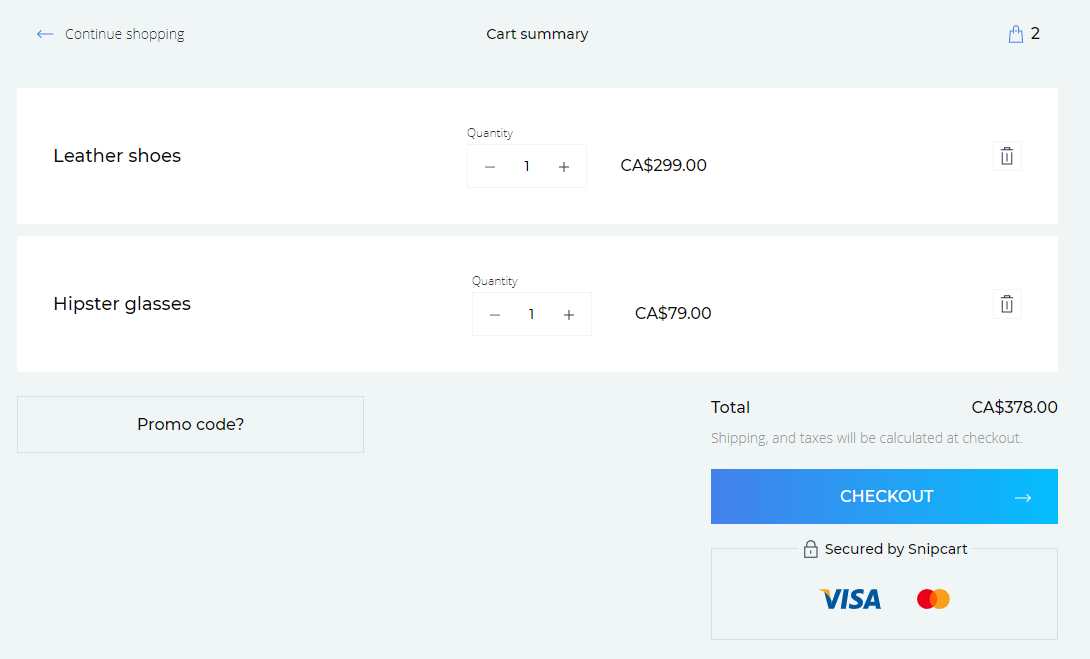
Add company name field in the address form
If you want to collect the company name in the address form, you can add the company field and the value will appear in the customer info.
<div id="snipcart-templates">
    <address-fields section="top">
        <div>
            <snipcart-label for="company">
                Company Name
            </snipcart-label>
            <snipcart-input name="company">
            </snipcart-input>
        </div>
    </address-fields>
</div>
Customize address fields
By default, the address fields offer your customers an address autocomplete component for a faster checkout experience. You might want something more classic.
To do so, you can override the address-fields component like that:
<div id="snipcart-templates">
    <address-fields>
    <div>
      <fieldset class="snipcart-form__set">
        <div class="snipcart-form__row">
          <div class="snipcart-form__field snipcart-form__cell--large">
            <snipcart-label
              class="snipcart__font--tiny"
              for="address1"
            >{{ $localize('address_form.address1') }}</snipcart-label>
            <snipcart-input name="address1"></snipcart-input>
            <snipcart-error-message name="address1"></snipcart-error-message>
          </div>

          <div class="snipcart-form__field snipcart-form__cell--tidy">
            <snipcart-label
              class="snipcart__font--tiny"
              for="address2"
            >{{ $localize('address_form.address2') }}</snipcart-label>
            <snipcart-input name="address2"></snipcart-input>
            <snipcart-error-message name="address2"></snipcart-error-message>
          </div>
        </div>

        <div class="snipcart-form__field">
          <snipcart-label
            class="snipcart__font--tiny"
            for="city"
          >{{ $localize('address_form.city') }}</snipcart-label>
          <snipcart-input name="city"></snipcart-input>
          <snipcart-error-message name="city"></snipcart-error-message>
        </div>

        <div class="snipcart-form__field">
          <snipcart-label
            class="snipcart__font--tiny"
            for="country"
          >{{ $localize('address_form.country') }}</snipcart-label>
          <snipcart-typeahead type="dropdown" name="country" autocomplete="country"></snipcart-typeahead>
        </div>

        <div class="snipcart-form__row">
          <div class="snipcart-form__field snipcart-form__cell--large">
            <snipcart-label
              class="snipcart__font--tiny"
              for="province"
            >{{ $localize('address_form.province') }}</snipcart-label>
            <snipcart-typeahead type="dropdown" name="province" autocomplete="province state"></snipcart-typeahead>
          </div>

          <div class="snipcart-form__field snipcart-form__cell--tidy">
            <snipcart-label
              class="snipcart__font--tiny"
              for="postalCode"
            >{{ $localize('address_form.postalCode') }}</snipcart-label>
            <snipcart-input name="postalCode"></snipcart-input>
            <snipcart-error-message name="postalCode"></snipcart-error-message>
          </div>
        </div>
      </fieldset>
    </div>
  </address-fields>
</div>
Customize the payment form
You can customize the payment form using the Snipcart SDK. See the SDK reference here.
Conclusion
We suggest you take a look at our components reference documentation. You'll find the documentation of each overridable template along with its default template.